Workadround to make iOS CollectionView in Ionic
For mobile, Ionic has got you covered with its ion-list. However currently (version 1.3.8), a CollectionView in Ionic, that should look and work like iOS’ UICollectionView, has not been implemented. The Ionic directive collection-repeat enables you to turn ion-list into a grid using collection-item-width and collection-item-height, but it’s still buggy. Worst of all, I can’t get the layout I want for bigger screens, but I found a simple workaround.
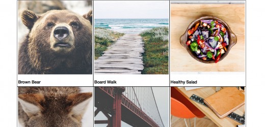
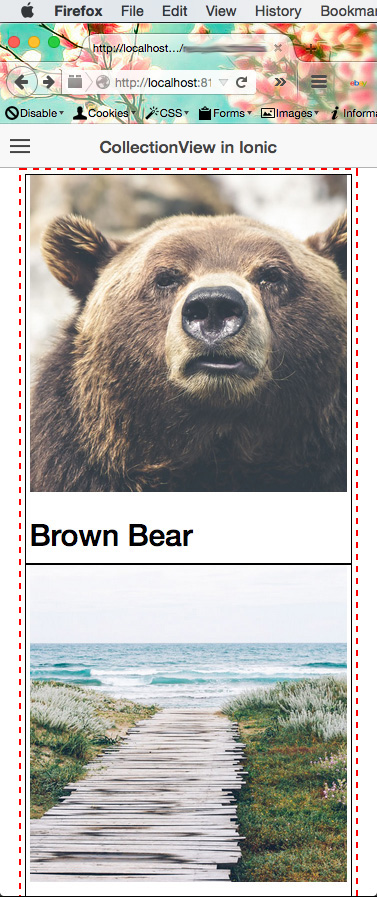
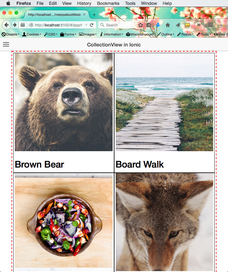
First, on mobile there’ll be 1 item per row, then 2 per row for mini-tablet sized screens, and 3 in a row for regular (original) iPad screen sizes. Below are some previews:
We won’t be using ion-list (sadly). But that’s okay, because ion-list is just a directive. We’ll be making a grid. On mobile screens, each item will be stacked together. Then we’ll use media queries to changed the layout.
Before we make the grid, let’s have some data. The data will be in a Factory module. Name it MockDataFactory in services.js
angular.module('app.services', [])
.factory('MockDataFactory', function() {
    var MockDataObj = {};

    MockDataObj.data = [{
        id: 1,
        name: "Brown Bear",
        feature_img: "./img/MIbCzcvxQdahamZSNQ26_12082014-IMG_3526.jpg"
    },
    {
        id: 2,
        name: "Board Walk",
        feature_img: "./img/O7A9fAvYSXC7NTdz8gLQ_IMGP1039.jpg"
    },
    {
        id: 3,
        name: "Healthy Salad",
        feature_img: "./img/oMRKkMc4RSq7N91OZl0O_IMG_8309.jpg"
    }, {
        id: 4,
        name: "Snow Wolf",
        feature_img: "./img/photo-1415904663467-dfdc16cae794.jpg"
    },
    ...];

    MockDataObj.ShowAllPics = function() {
        return MockDataObj.data;
    };

    return MockDataObj;
})
To get these data into the view, make a controller and inject the Factory module. (controllers.js)
angular.module('app.controllers', [])
.controller('AppCtrl', function($scope, MockDataFactory) {
    $scope.things = MockDataFactory.ShowAllPics();
})
Use $scope to put the data from MockDataFactory to the view.
Before we dive into the CSS, here’s the markup:
<ion-content>
  <div class="collection-container" ng-controller="AppCtrl">
    <div class="collection-item" ng-repeat="thing in things" >
      <img ng-src="{{thing.feature_img}}" />
      <h2>{{thing.name}}</h2>
    </div>
  </div>
</ion-content>
This markup displays the image and the name from the MockDataFactory. The image and the name are grouped in collection-item class. The collection-item is what we’ll modify to change the number of items in a row.
Now for the CSS. Let’s start with mobile-first.
.collection-container {
    /* Center this container */
    margin: 0 auto;
    display: block;

    /* padding as gutters */
    padding: 0.25rem;

    /* Set the width to 90% instead of 100% so there'll be gutters */
    width: 90%;

    /* .container will not stretch more than 1120px */
    max-width: 1120px;

    /* debug just to see the container */
    border: 2px dashed red;
}
.collection-item {
    /* Each items will be a block so that
     * they'll stack up on each other
     * (mobile-first perspective)
     */
    display: block;

    /* Gutters */
    padding-left: 0.25rem;
    padding-right: 0.25rem;

    /* Make it responsive by complying to
     * parent's width
     */
    width: 100%;

    border: 1px solid black;
}
.collection-item img {
    /* Make it responsive */
    height: auto;
    width: 100%;

}
In the above code, I’m defining the collection-container class so that it’s centered with a maximum width of 1120px. I don’t want it to be bigger than that. I’ve included a border. It’s for debugging purposes and you may exclude it.
For mini-tablets, I want 2 items in a row. To achieve this, collection-item class is updated to have width of 50% and inline-block display.
@media screen and (min-width: 600px) {
   .collection-item {
      width: 50%;
      display: inline-block;
   }
}
For bigger screens like the regular (original) iPad and wider Android tablets, I want 3 in a row.
@media screen and (min-width: 800px) {
   .collection-item {
      width: 33%;
   }
}
Don’t forget to add these JavaScript files in the index.html right after cordova.js.
<script src="js/controllers.js"></script>
<script src="js/services.js"></script>
…and in the app.js add them as additional modules just like this:
angular.module('starter', ['ionic', 'app.controllers', 'app.services'])It really depended on the CSS. I didn’t use any grid frameworks to avoid bloat. I didn’t use the Ionic grid either because it didn’t give me what I wanted. If you want to design for bigger screens like TV’s, use a bigger maximum width and have more items in a row.
Thoughts
It makes me sad that I have to make a CollectionView in Ionic like this. I really want to use ion-list, but as of now, it’s just really buggy. Though in the end, everything is still HTML5 and CSS3. Some would argue that collection-repeat can handle a lot of data. Angular’s ng-repeat should be able to handle a lot of data as well. I’m still anticipating the fixes and updates for Ion-List’s collection-repeat and its grid! At least for now it works on iOS and Android.